You approve a sign drawing on a laptop, print a copy for the property manager, and review the same file on your phone. The logo can look slightly different on every screen and sheet of paper. Which version should the fabrication team follow?
A physical color reference can help turn that uncertainty into a clearer production decision. It gives the people approving the sign and the people making it something specific to discuss. Its usefulness depends on identifying the material, finish, lighting conditions, and part of the sign the approval actually covers.
At Addisigns, our designers and fabrication team work from the approved project information. When color matching is important, ask us what reference and approval method make sense for your sign before treating a screen image as the final standard.
Define the color decision you are making
Start by listing the components that carry your brand color. A sign might combine painted metal, translucent faces, applied graphics, and an illuminated logo. Those materials interact with light differently. A single color name does not fully describe every component's intended appearance.
Tell the team whether you are matching an existing sign, a current brand specification, or a new finish selected for the property. If an older sign is the reference, explain whether its current appearance is intentional or whether you want to return to an earlier documented color.
Ask which physical sample would be useful for the decision. A painted metal sample answers a different question from a piece of translucent face material. Establish that distinction before requesting a sample or arranging an approval meeting.
Give the team an authoritative reference
Provide the current brand files and any specified color references together. Identify the person who can resolve conflicts between a logo file, a printed brochure, and an older set of guidelines. Otherwise, a production question can turn into a search for which department has the latest version.
If several locations are involved, use one agreed reference rather than treating whichever sign is closest as the master. Existing signs may have different ages, materials, and service histories. Matching each location independently can preserve those differences rather than bring the program together.
Our custom sign design service can help translate approved branding into a sign concept. Be clear about which reference is mandatory and where the project allows a practical material or finish selection. Document the decision so it remains understandable when the job reaches production.
Review the material and finish together
Color approval should identify the sample's surface as well as its color. Gloss, texture, and metallic effects can change the impression of a finish. Compare the proposed sample with the material and application described for the actual sign, and ask the team to explain any important differences.
A very small sample may help narrow a selection without answering every question about a large sign. Ask whether its size and form are sufficient for the approval being requested. If the project requires another type of review, agree on that scope before production begins.
Keep the sample clean and identifiable during review. A label should connect it to the project, component, finish description, and version being considered. That makes it harder for an earlier option to be mistaken for the approved choice when several similar samples are circulating.
Consider the lighting in which you compare it
Two materials can appear to match in one light and differ in another. Color-science company X-Rite explains this effect, called metamerism, and recommends evaluating samples under different light sources when checking for it. That principle helps explain why an office review may not settle every question about an outdoor sign.
Discuss relevant viewing conditions with the sign team. Daylight, interior lighting, and the sign's own illumination may each matter to your project. A surface-color sample is not automatically a demonstration of how an illuminated face will look after dark.
Avoid trying to settle a disputed color by sending more phone photographs. Those images are useful for communication, but the camera, exposure, display, and surrounding light can introduce further differences. Return to the agreed physical reference and review conditions when making the approval decision.

Record exactly what has been approved
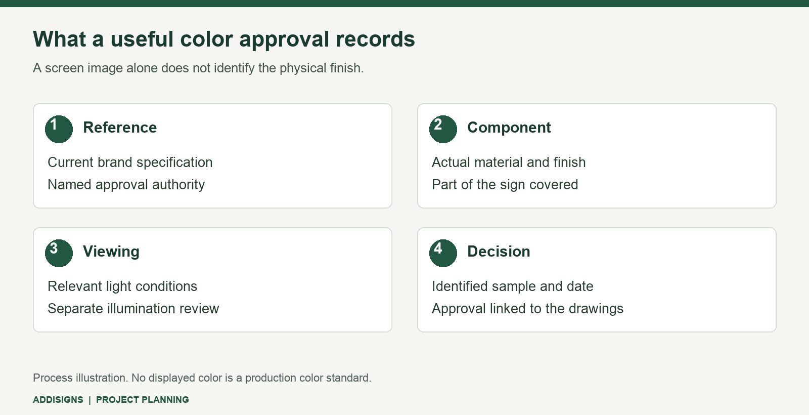
An approval should connect the sample to the sign component and the production documents. Record the sample identifier, finish description, approval date, and approving person. Note any conditions or remaining decisions, particularly if illumination or another material still requires separate review.
Ask how the approved reference will remain available during fabrication. The goal is a clear connection between the item you reviewed and the instructions the shop receives. Confirm the actual process with your project contact rather than assuming every project uses the same sample workflow.
If the selection changes, document which earlier approval it replaces. Send the update through the project contact so the drawings, material instructions, and schedule can be reviewed together. A casual request to “use the slightly darker one” is difficult to interpret once the samples are separated.
Set expectations for replacements and later phases
Keep the approved reference and its records after installation. They are useful if you add another sign, replace a component, or extend the branding to another property. Record what was built rather than relying only on a color description in an email subject line.
For a later replacement, tell the team whether the objective is to follow the original specification or to coordinate with the surrounding sign as it looks today. That is a project decision requiring assessment; it should not be left implicit in the phrase “match existing.”
Physical approval also does not establish an unlimited promise about every future material or production run. Ask what can be evaluated and documented for your particular sign. Clear expectations allow the team to discuss practical options without turning a reasonable reference into an undefined guarantee.
Make color approval part of the project plan
The best time to clarify a critical color is before it becomes finished sign material. Send us the current brand guidelines, approved logo files, and any physical reference you want considered. Identify the final approver and tell us where the sign will be viewed.
Addisigns handles sign fabrication in its Tucson shop. Call 520-748-1540 or request a quote to discuss the drawings, materials, and approval steps for your project.